
Oracle
Redefined, created and enhanced the way Los Angeles County citizens are able to manage their property tax while making it easier for the County to better serve it’s 10.02 million population.
Project Details
- Industry: Public Sector (Government)
- Role: Digital Design
- Company: Oracle
- Client: Los Angeles County
- Date: 2016-2017
Quick Facts
- Los Angeles County has a $1.2 trillion assessment roll
- Consists of 2.6 million properties
- It is the largest county in the United States in terms of population
Case Study
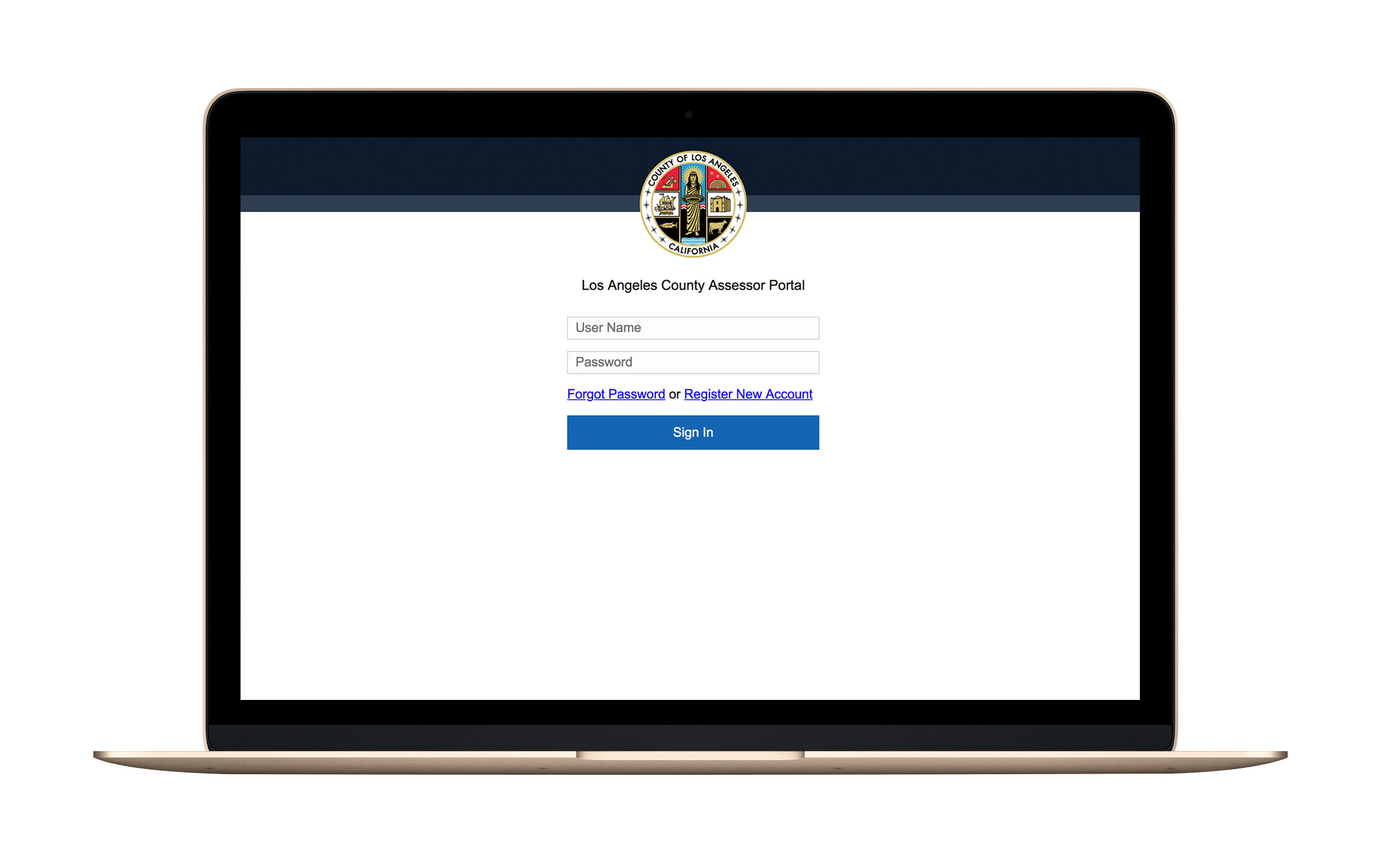
The Los Angeles County Office of the Assessor updated a 20 year old computer system in order to allow the office to move away from a paper-based record-keeping system and allow staff to be more efficient.
Our responsibility was to design a modern and intuitive search engine to search the county’s large data base and many business tools to be used by internal teams.
- Research and Strategy : – Created user personas based on stakeholder interviews and workshops with user groups.
- Information Architecture : – Created user flows representing the future state of pages to be designed and developed.
- Holistic Design Audit : – Documented already existing user interface components into a coded design system as well a new components.
- Prototype : – Created high fidelity prototypes to review with internal team and handed off to development.
User Flows
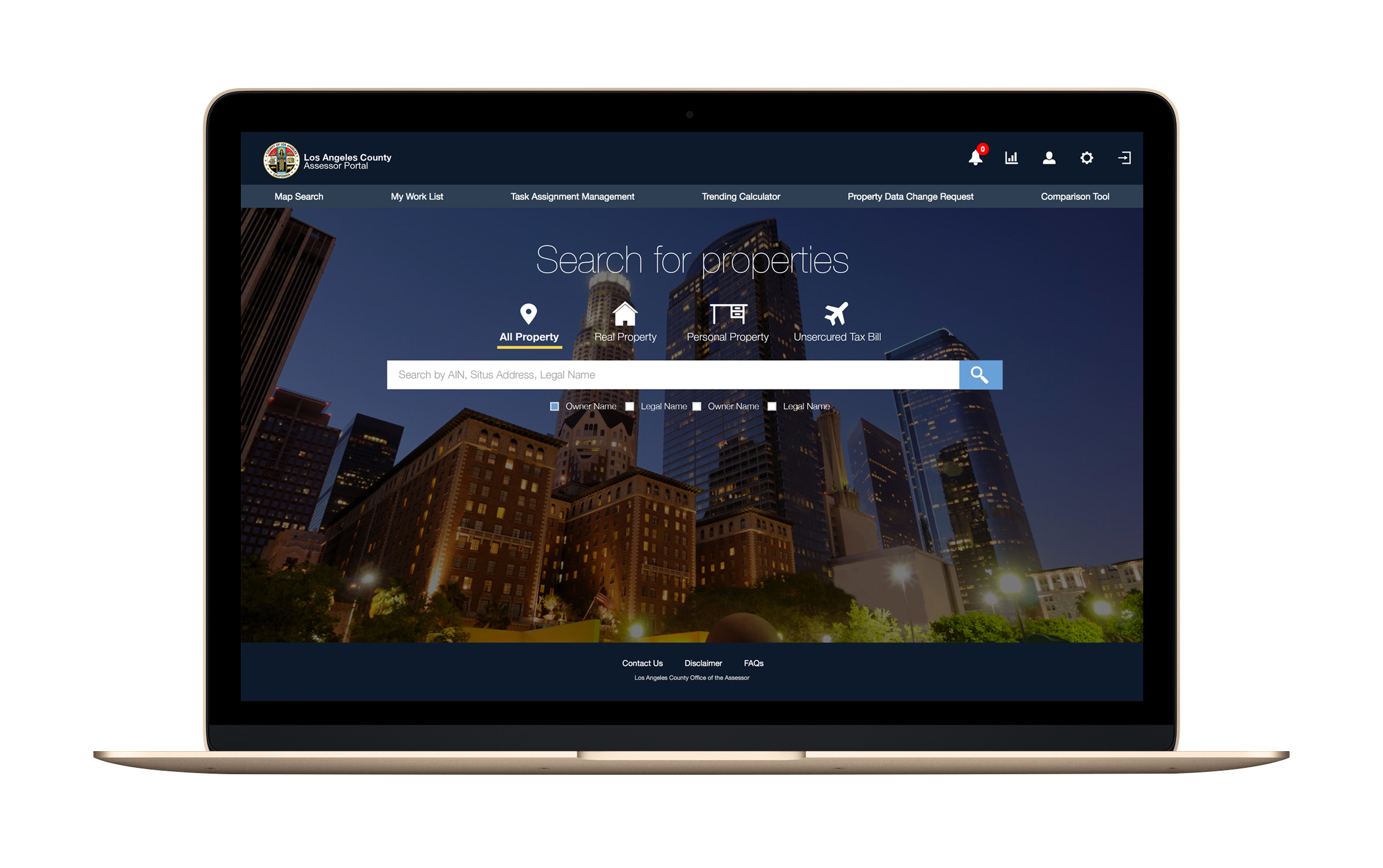
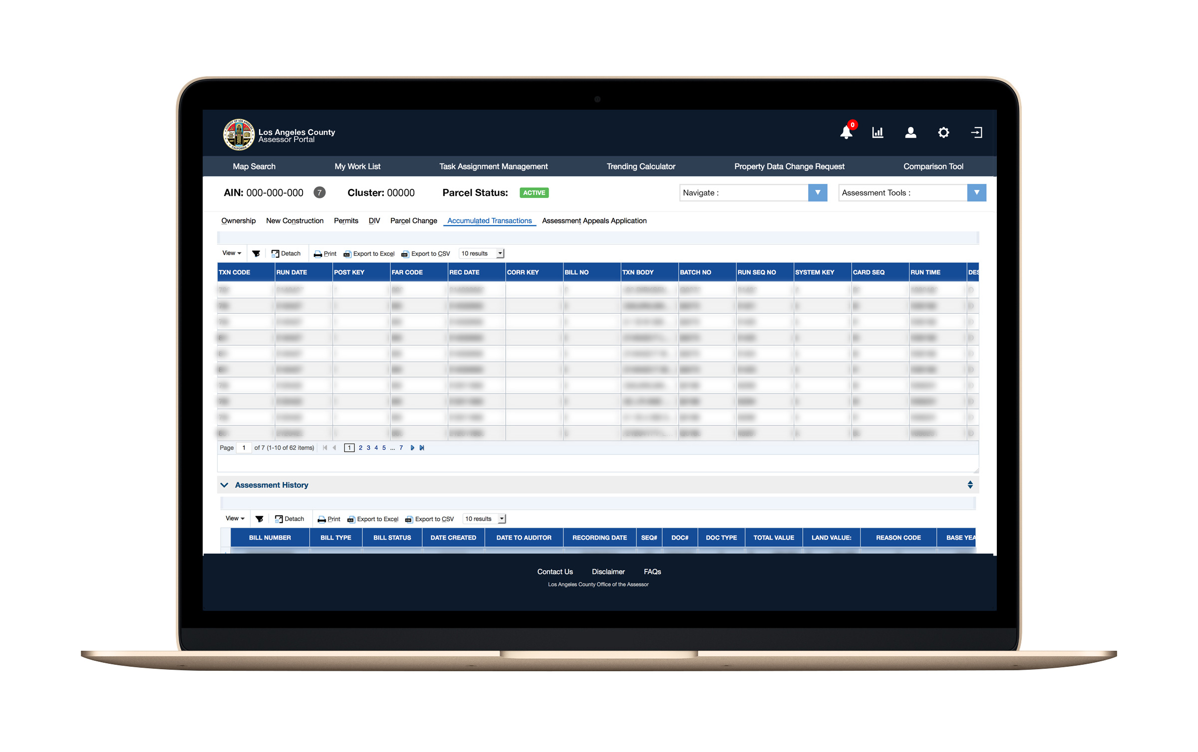
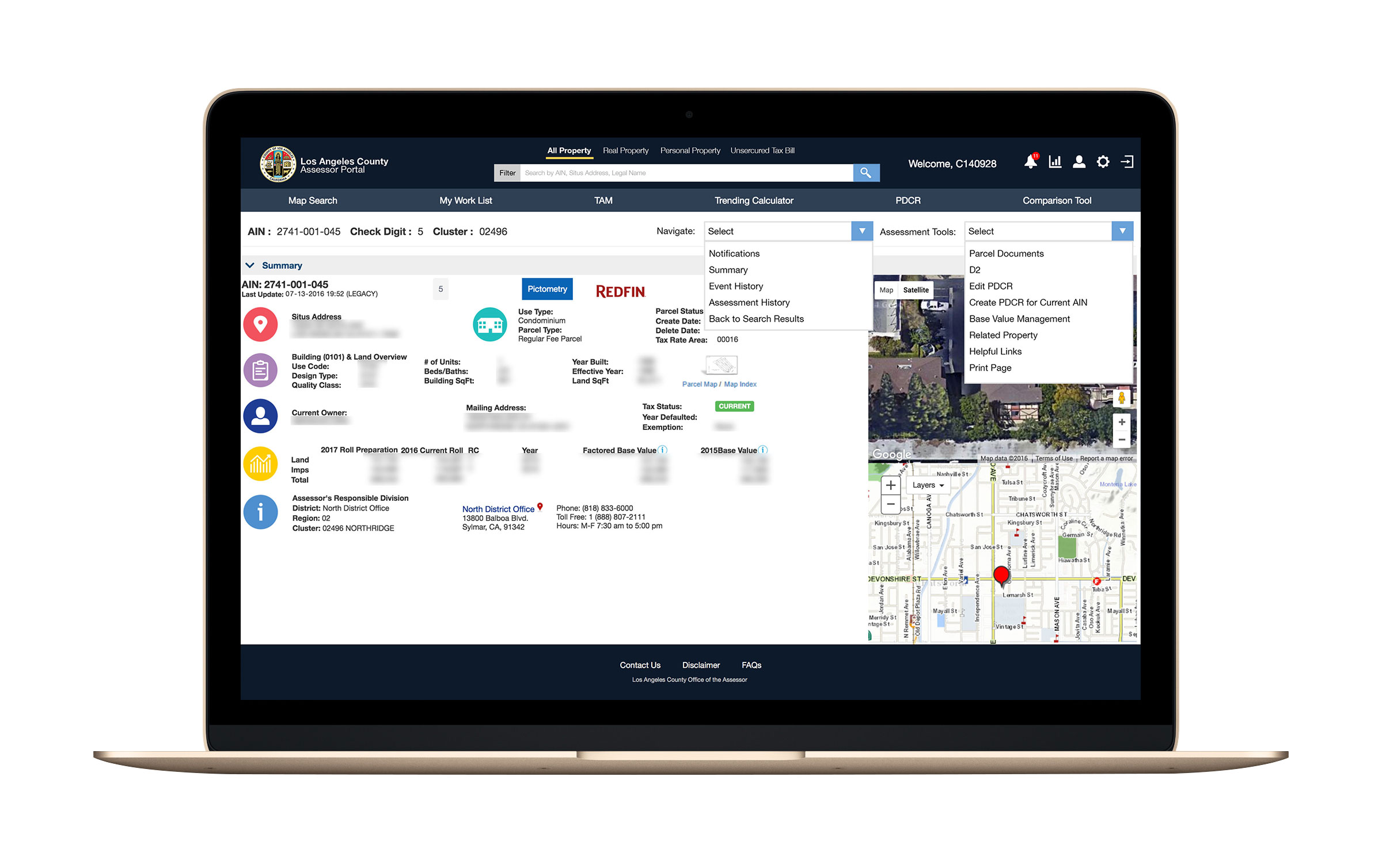
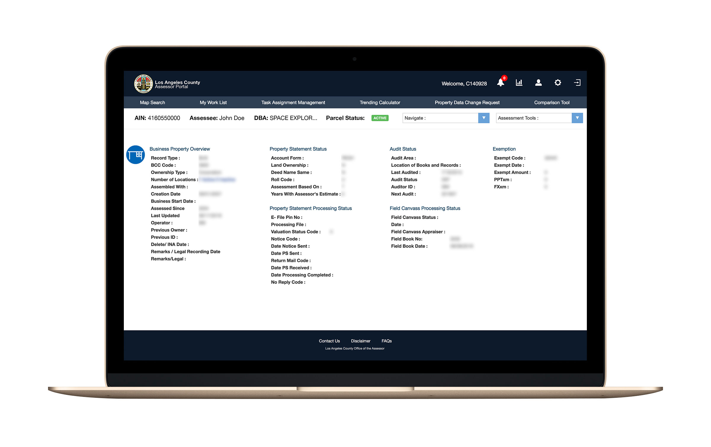
Web Application
There were a total of five different components that all came together in the web portal. One of the main focuses was on the search box which allows the user to search based on different property types and filter through them based on other criteria.
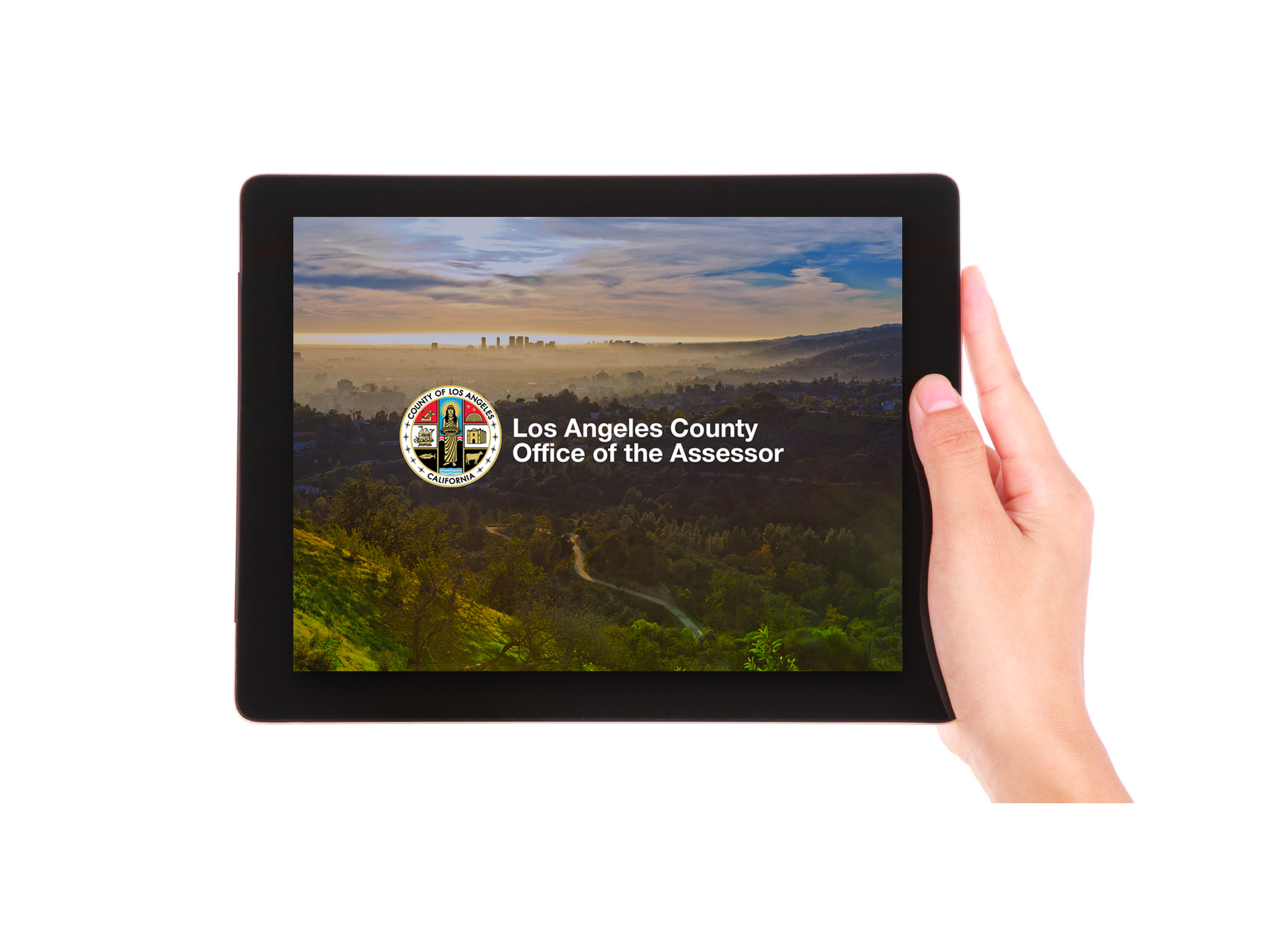
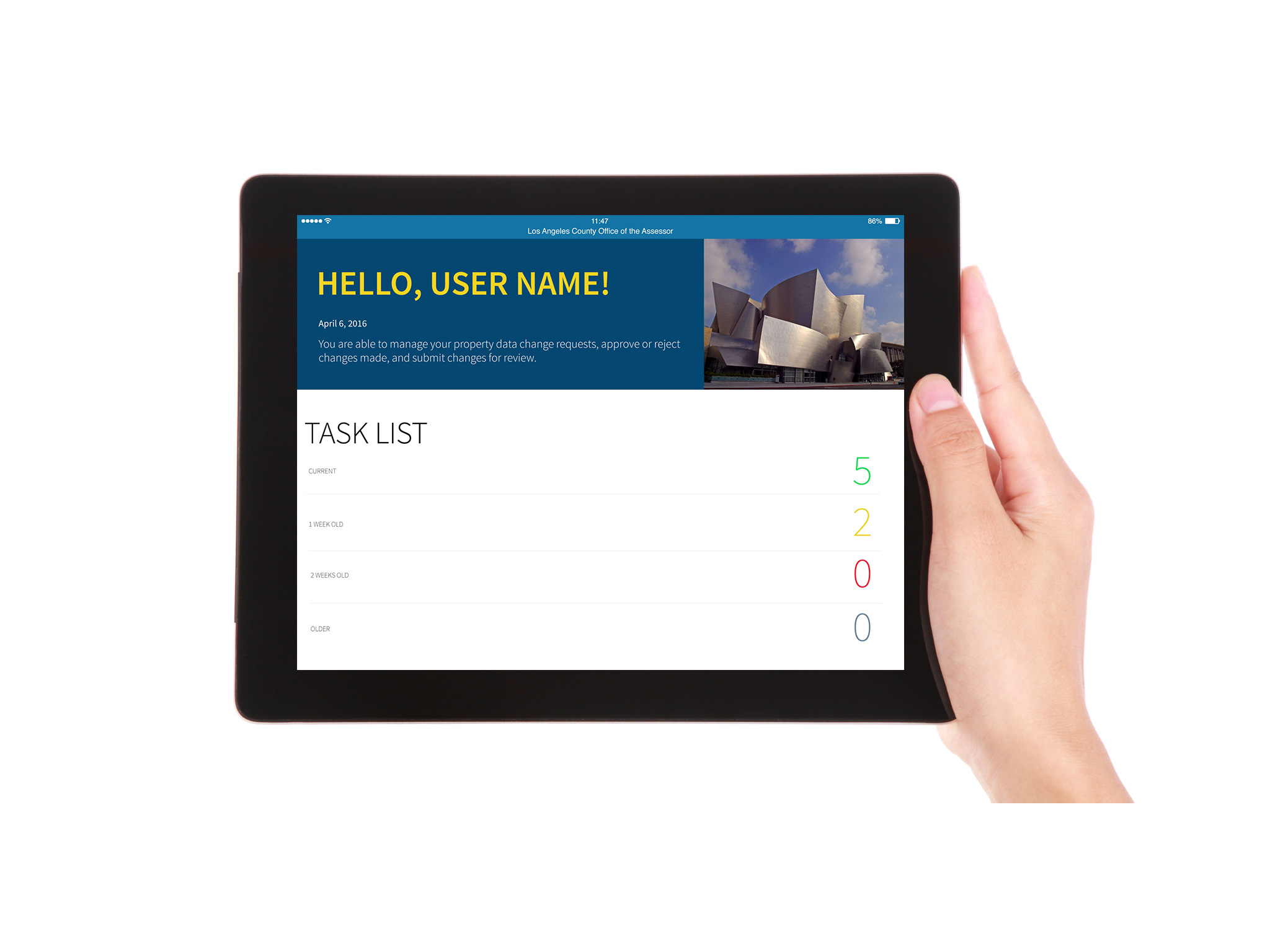
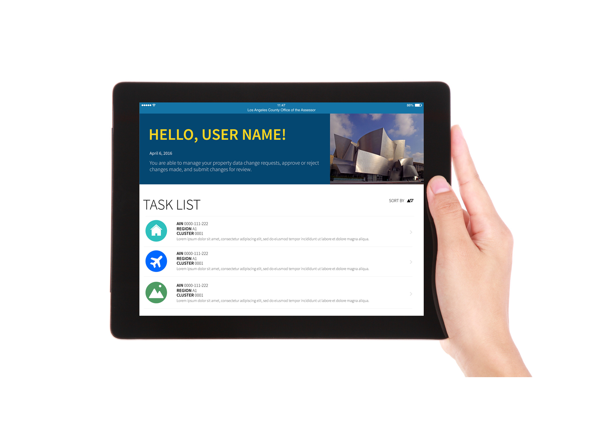
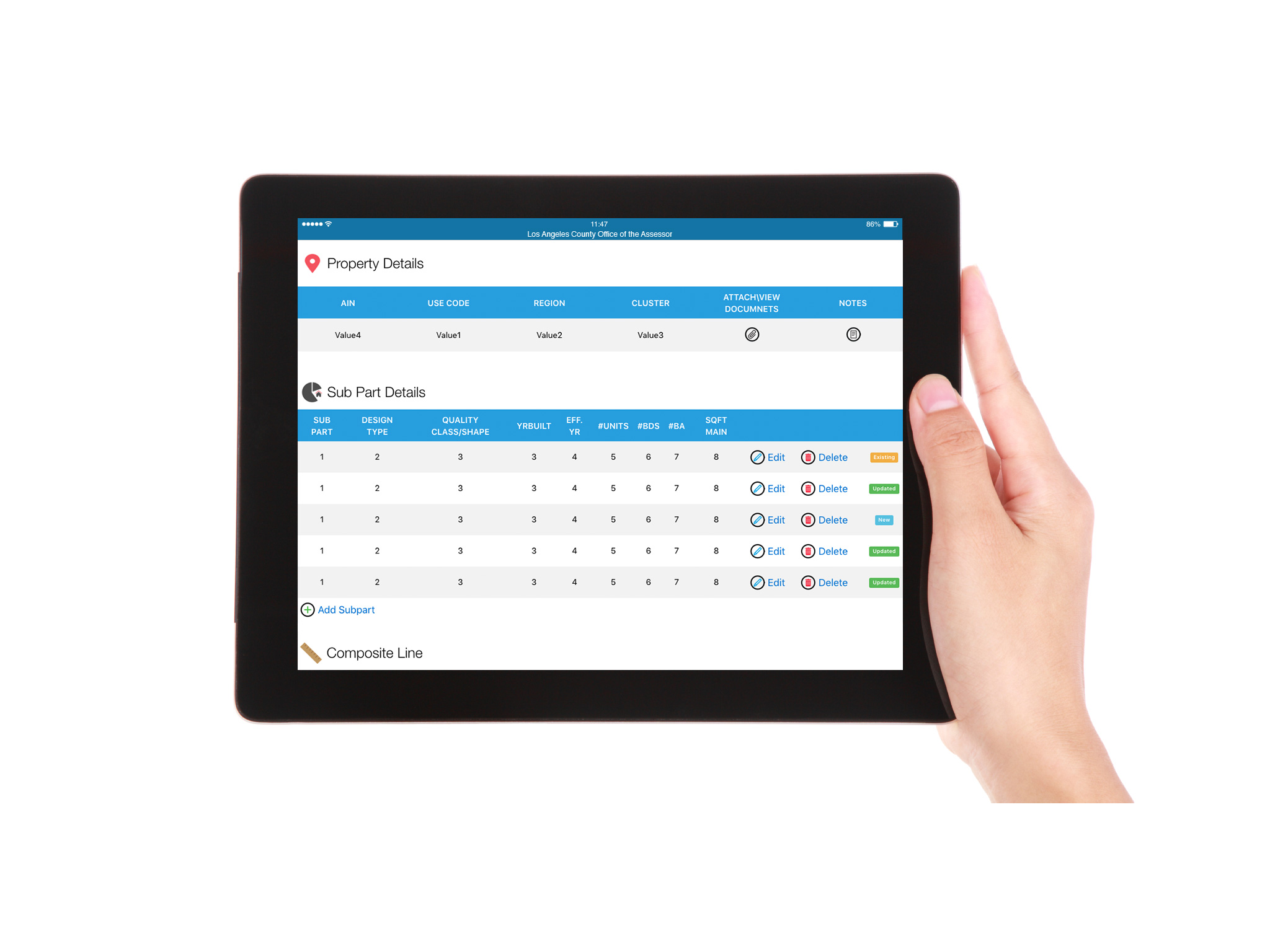
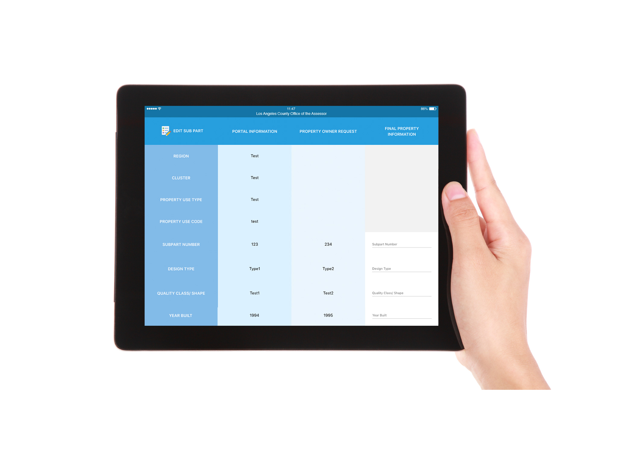
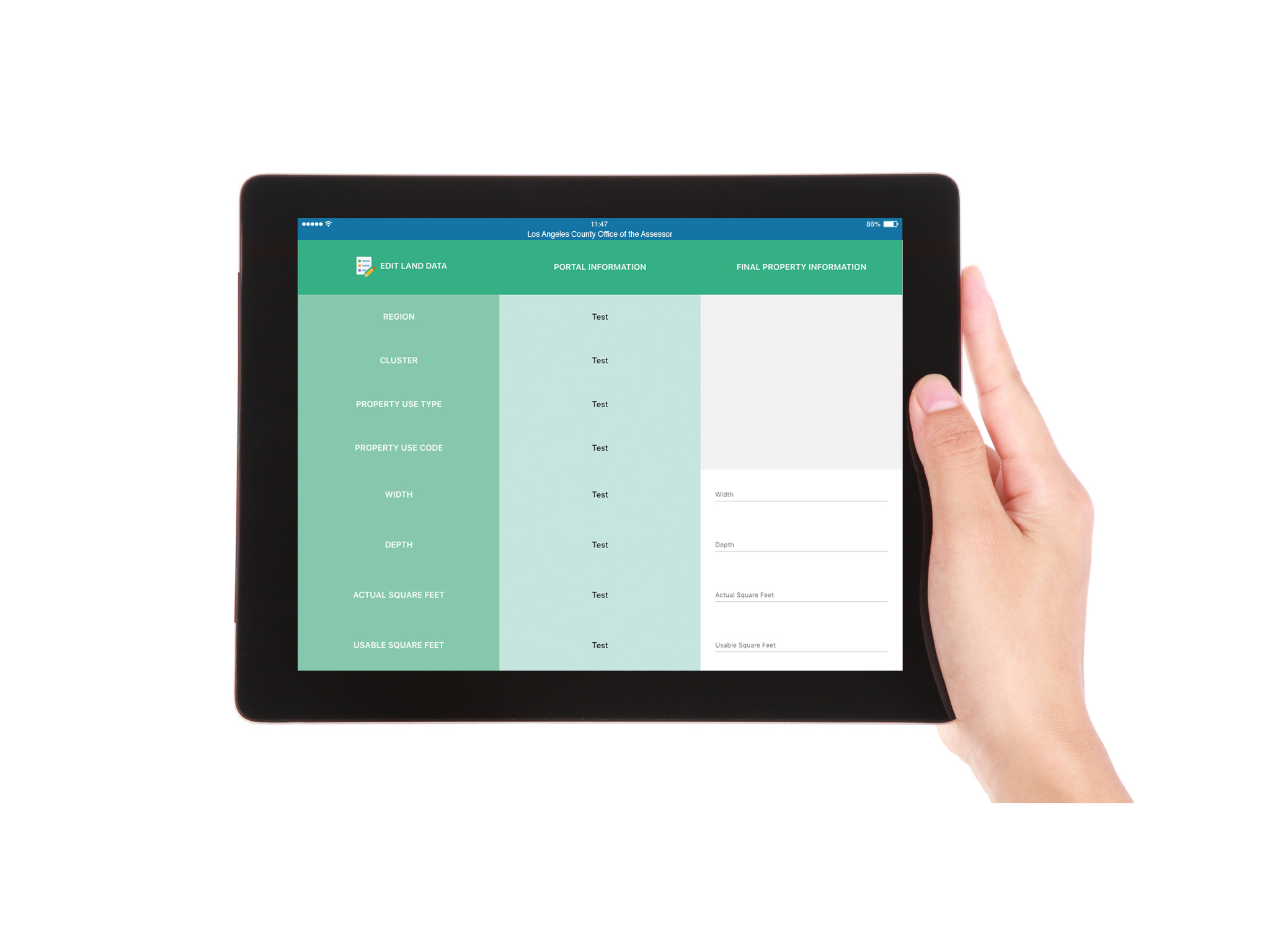
iOS Application
The iPad application was a pilot project and was created to supplement the web portal. The application allowed internal teams to complete tasks while in the field. The design process went from low fidelity prototypes to a high fidelity coded version. Below you will find images of the prototype that was created. The screens are organized progressively in order of the user flow. The user views tasks, updates or edits, and then submit changes to be reviewed.

Deliverables
Design System
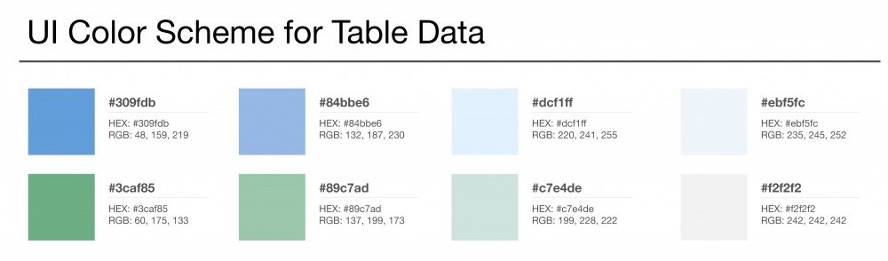
Created ADA compliant design and components. Defined colors, fonts, iconography and visual design elements for both web and iOS application.
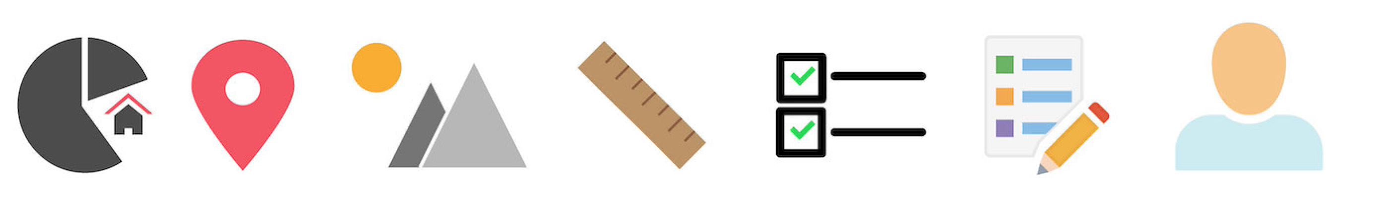
Qualifier Icons
An optionally clickable icon that accompanies page content. They are provided to only reinforce associated concepts on the page. In short, they are redundancy cues. These icons were mainly used in the iOS application in order to provide design cues for the user. They are also used in the web portal as well.
Achromatics Icons
These artifacts were used across multiple UI’s and provided consistency across multiple devices and technologies. Icons are used to provide information in a visual way to users. Colors are used to provide groupings of related types of property. Achromatic Icons fall under the qualifier type and their style is complimentary to the Mono Color Icons. What distinguishes these icons is that the palette is applied to the background instead of the icon. Achromatic Icons are white with NO stroke information applied to them.
Application Navigation Icons
Icons used to provide access to major application/functional modules different icons for the user interface of the mobile and web application.
Functional Icons
Icons used to provide access to major application/functional modules different icons for the user interface of the mobile and web application. Functional Icons are primarily 16×16 pixel size icon with a label.